I was putting some things off during the Twins game yesterday and the game wasn't enticing any more, I played with Excel and baseball-reference's CSV data table option. As I did this all during the game, it does not reflect the results of the games of that day. So, although it looks like the Twins are a game out of last place, they are now in last place, again (by percentage points behind the Royals).
I like to "look" at data, so this is my looking at it. I think of this stuff like I'm taking the progression of the season -- distilled into statistics -- and converting it into a graph that then informs my narrative.
———————————————
The style of the first table may be memorable from the WGOM 1.X: games above (below) .500 in the division, showing the development of the race over the season. The ordering of the teams, however, is not familiar.
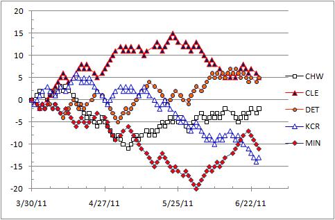
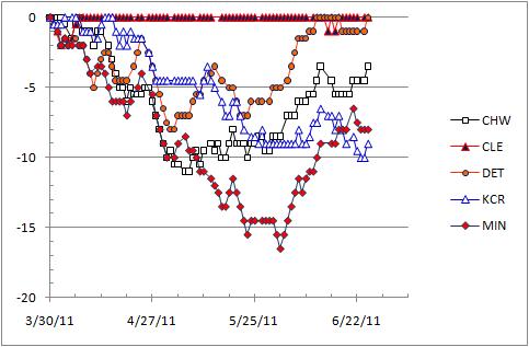
Another way I've thought of presenting this is as games behind first place. Whichever team is on top is in first, with the other teams however many games behind (as negative numbers) below. If the division ends up being won with 85 or fewer wins, that may be a more instructive graph.
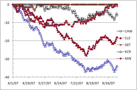
To remind ourselves what the season looked like the last time that the Twins made a comeback similar to what we'd love to see this year, here are the full-year graphs for 2006. First, games above .500, then games behind first place.
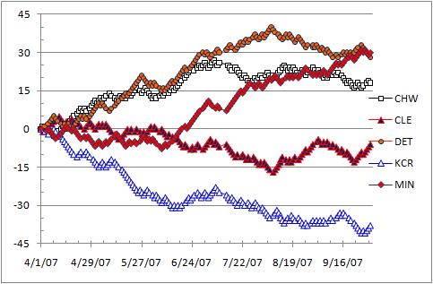
Now, through 75 games, let's compare the 2006 season to the 2011 season.
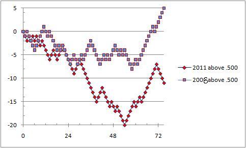
Wow, the 2006 Twins were 8 games ahead of the 2011 Twins through 75 games.
But check this out, games out of first:
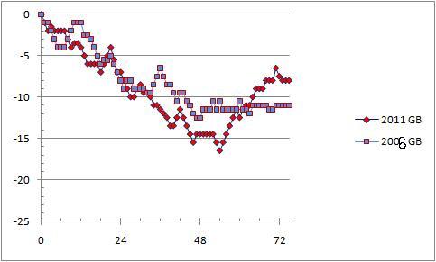
The 2011 Twins were further behind at their worst, but once the team started winning, they started to gain on first. When The 2006 Twins started winning, so did the Tigers and ChiSox
———————————————
Another thing I realized I could do is follow each player's performance through the season. I figured I'd start with offense, specifically OPS. As there's no natural way of coloring these graphs, I just went with Excel Default alphabetically. I only included players with more than 25 PAs. (Tosoni has the fewest PAs among those that are in with 47. The only non-pitchers who missed the cut are Steve Holm with 18 and Dinkleman with 17.) That was 18 players though, so I split them up into four groupings.
First: Opening Day starters who haven't missed much time. Cuddy, Kubel, Morneau, Span. (Yes, I know, three are on the DL right now. Is that ironic?)
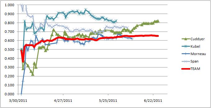
Morneau has been typical of the team. His OPS looks so perfectly correllated with the team's total.
Cuddy's recent run is pretty evident.
Second: Opening Day starters who have missed tons of time. Mauer, Nishioka, Thome, Young. (Yes, Thome wasn't an opening day starter, but he was opening day top-choice pinch-hitter.) Furthering the possibility for irony, three of these four are now active.
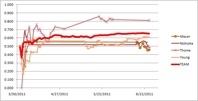
I decided to connect points when time was missed (or else everyone's graphs were just disjointed points). That means that Long flat sections without point markers are either DL time or Rochester time. These four guys were all in the DL camp.
Third: Regular Infielders. Casilla, Good Hughes, Plouffe! (for some reason), Tolbert, and Valencia.
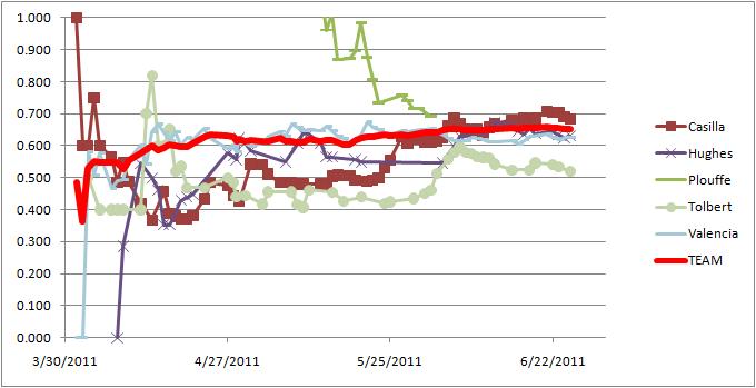
Valencia tracking team average almost as well as Morneau. GH and Casilla are finally up around the team average now.
Fourth and Final: Backup catchers and call-ups. Butters, Repko, Revere, Rivera, and Tosoni.
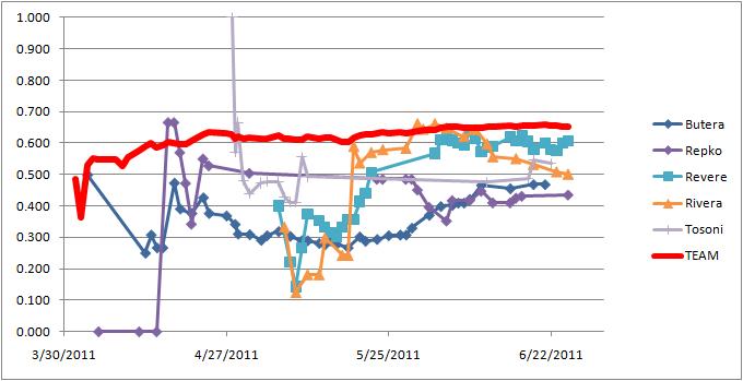
In SSS, Rivera looked much better than Butters. Then in June, Butters hit nearly .400 from June 2-21, bringing his OPS up to nearly .470, from depths below .270. Over that same period, Rivera hit 0.060, dropping his once-impressive* .660 OPS down to .500.
Revere had a nice run there in mid-May, before his demotion for either Thome or Repko.
*Relative to 2011 Twins catcher expectations.

Shouldn't that be 2006, not 2007?
D'oh! Yeah, that's the one. I shouldn't have done that so late at night.
Everything but the full season 2006 graphs has been fixed.
Like the players graphs