Welcome to the new WGOM. If everything seems the same still, come back in a few hours.
Prominently displayed are six "featured" posts. The first three in the top row are from left to right: the Cup, the Video, and the latest Fitness post. The next three, in the bottom row, are the three "hottest" posts, judged by comment count and age.
This new theme encourages posts to have a featured image set. hungry joe tirelessly created a bunch of images that will automatically be set as the featured image by default. You don't have to abide by his visual tastes and can set your own though.
The theme is still in beta stages and small visual fixes are needed in several places. Consider this thread a good spot for pointing out things you do and do not like about the theme.
Finally, don't forget about the WGOM/CdL caucus tonight at 6 PM at Barley John's Brew Pub.
OMG what is happening?!?!?!?! 🙂
My cheese has been moved!! 😀
I hate to say anything critical, because it will be taken as disapproval, and that's not the case. A couple things that do jump out at me, though:
-- black?
-- the formatting button bar on this LEAVE A REPLY are white on white (except for the LINK button)
-- video in the top row, plus video archive on the bottom right column, plus videos in the posts column...I enjoy the daily video feature, but that's giving it more than enough home page space, isn't it?
-- I don't know if the second row posts are the right idea. For instance, last Friday's desert island post is there; won't this just encourage more commenting on the prominent posts, ie: the Yankee Effect? I have to work even harder now to see Jeff's posts.
Also noticed the counts aren't under the recent letters headlines; that was how I at least knew there were additional replies when I refresh.
It was nice when the edit and reply links were on the same line. The LTE's are sprawling vertically IMO, and the more I can read on one page, the better. Same goes with the font size of the homepage posts down below -- lot more scrolling.
I'm going to second the counts thing. I didn't notice it right away, but I'd love to have counts listed in the featured post links.
Same button bar problem here.
Fixed.
ooooh, great! Now fix my lack of 401(k) company matching, please.
I'll just need your bank account and PIN numbers, as well as those of your employer.
*Pulls out the classifieds*
1. I agree with Rhubarb: not a fan of black. Not sure what color would work best, but something less harsh (says the guy whose personal website is black).
2. I also agree that the videos don't need to take up so much space. Sometimes I would like to go through the last week's music videos, but I would prefer that be a link from the main page rather than scrolling down the right side.
3. The right fourth of my page is completely blank. Is this my resolution?
Now for what I like:
1. I like how the prominent posts are featured right in the middle. No offense to Jeff, but sometimes I'll miss the movie day post or something similar because it's been buried under five of his posts. I also like that the Fitness post is more prominent, since people tend to comment on that throughout the month.
2. I think I like comments being on the left side rather than the right, but I'm going to have to get used to it.
3. I like how the middle is a scrolling feed of everything. Before if I wanted to look at a recent cup of coffee I had to go to the archives. Unless I'm dumb and it was easy before, then never mind.
Extra Thoughts
Like the fitness post, would people be interested in other ongoing posts? We tend to talk about movies on one day, books on one day, video games on one day, and parenting on one day. However, this seems silly, especially when people say that they're waiting to say something until that specific post comes up (and with how many new parents we have!). How about a permanent link to the most recent post for all of those so people can comment ongoing? I realize that would be even more icons right up front, but I think I would prefer to have permanent links to those monthly sections.
I've always felt kind of bad about that myself.
Commenting just to say like like how quoted text is visually distinct from regular LTE text.
I like Beau's way of doing it, so I'm gonna copy that. Also, I'm generally not one too opposed to changes.
1. I'll echo the black not a fan thing. I've always been partial to the whites and off-whites, with black text.
2. And, in some contrast to that point, I'm definitely seeing too much white space in the thread here. And that thin grey "third column" way over on the right is driving me crazy.
3. I don't think I like the left-side bar for recent comments. I'd probably get used to that one, but I think I'd prefer not to.
4. I think, for the most part, things are just too big. When I navigate to the page I've got to scroll down to see the bottom half of the highlighted posts. Some of the images above posts seem to just occupy space, and a bit too much of it. Yes, I'm complaining about having to scroll too much.
What I like:
1. I really do like the images themselves for the posts. That's an awesome idea. I just don't like that they're separating the posts so much.
2. I like that the features/search/etc. list got moved below the banner. I think I'd drop it somewhere else, since it's sort of a partial bar, above the featured posts, which seems odd (possibly above the recent comments?), but I like that the banner is at the top.
3. I kind of like the last 5 videos on the main page.
I'll echo Beau's comment for ongoing posts. I love that we have dedicated days, where lots of conversation happens, but ongoing is absolutely worth trying. I think it also gives potential new visitors a better feel for the site, up front. I also think, come baseball season, it'd be good to have some Twins stuff featured most prominently. Perhaps shrinking the size of the featured things, and upping them to 8, or something?
i disagree with the ongoing posts idea, actually. what i like with the current system is we get a concentrated dose of discussion within the scope of whatever subject. if we have ongoing posts, info will come in in little drips and drabs to the point of no one really paying that much attention to them. if we have 5 different subjects going that people add an LTE to every few days, would you pay attention? also, we've never limited discussions (aside from people perhaps saving longer discussion for [fill in the blank] day). if there's something that someone needs to talk about before a certain post's time, we've always been able to throw it in the CoC.
and, in addition to a healthy and vigorous discussion, i like the rotation aspect. each week, or twice a week, we have a feature, something that stands out among the day to day, and keeps cycling through topics to keep things fresh. keeps things interesting.
I'm with joe.
I do like that aspect of it too, but I think it might be worth trying the other way 'round, at least for a time.
Dido. The CoC is where this place really comes alive, and I'm concerned that dissipating the conversation also dissipates the momentum of a thriving community's public square.
Co-signed.
I love that the M in WGOM is getting a bit more emphasis with this layout. (The W and G are self-evident.) Good call, guys.
I'll second that. I assume that could be done via post categories or tags, i.e. the most recent post in the "Minnesota Twins" category shows up in that designated spot. I imagine Game Logs making one of the featured spaces won't be an issue because of the high comment volume on those posts, though it will mean we have to remember to scroll down to find it when it first goes up and gets hot. No biggie there.
Thanks. I liked the old theme plenty, but it had been in use for quite some time. I liked Stick changing the theme and wanted to continue that theme. Finding themes for this site is difficult. Not many fit the profile. When I saw this theme being a "magazine theme" I knew it would be a worth successor.
Yes, but only because the theme has a maximum width.
I... like it! Tweak the tweaks but the site used to be pink and I still came here, so... you know.
I'm so old, I remember when the old site was salmon colored!
Also I liked seeing the stars on video, it would remind me to vote.
Mags and I were talking about that color scheme in the old basement last night. Woof, but it is the stuff of memories.
I considered it more light puce.
I refuse to recognize that as an actual color.
didn't the Cup of Coffee the last two days talk a lot about puce?
You probably don't think of "Yankee Blue" as off-black either, do you?
(also just kind of wanted to test out a YT embed)
Whoa. I don't know if I like it yet or not. It's just--really different. It's going to take some getting used to.
This.
Plus, what's the font. Everything is a lot...bigger. Much more white space. And the fonts in the buttons when you reply are all but illegible because lack of contrast.
There was even more whitespace before.
I'm not sure I believe that. I'm doing a lot more scrolling with the new theme.
Really? It seems there's more vertical white space between comments. Or is the text bigger?
This is what it looks like to me:
Maybe removing one or more of those blank lines, or moving the Edit and More Options Plugins to the right of the Reply button would tighten things up.
A few more things...
1. This follows the CdL format where a reply goes under the LTE it's replying to, above all the other replies to the same LTE. I prefer the old way. Especially because sometimes it's continuing a max-nested conversation.
2. I liked the Blockquote text showing indented and boxed a bit. I think of that as a place for longer quotes, and that offsets them like I would back in college papers and whatnot.
3. Yeah, the text is definitely bigger. Particularly the text in the Blockquotes and on the Spoiler box header. Maybe I'll change my settings for the page on this side.
Changing the font size made some of the other things really small, but I think I prefer that.
Also, are there still category links in each post? If so, I can't find them.
I know I missed a lot of yesterday's Cup of Coffee and that's typically how I go back to read the discussion unless the discussion is still ongoing.
OK, I found the category link. It used to be under the post text, now it's above the title.
Easy enough. Tags are still where they used to be, I see, but now they look like tags.
I agree that more is better, so a smaller font and less white space would be nice.
SEND HIM!!!!
[edit: boy, SEND HIM! is disappointing in this theme/font. Even Span wouldn't lead off with that.]
The category links are at the top. However, all posts not in the featured bar at the top are in the main column, so halfway down the front page is yesterday's Cup.
The font is called Lato.
I agree that it feels like there's a lot of white space vertically and that the point size of the font feels a little large. Definitely feels like more scrolling and that I'm seeing fewer
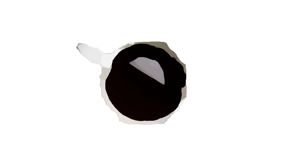
LTEscomments on my screen at one time.GUYS THE COFFEE CUP CHANGES SHAPE. Or I need to go lie down for a bit.
It's not just you- I'm seeing it too. I thought maybe I was hallucinating.
More likely both.
sean or hj (whoever made the image), you should have trolled many of us coffee drinkers around here and had the coffee turn to a dark tan at the end.
We're always open for submissions! There are two more Cup images that need to be uploaded. More would be great. If we can reach seven, I'll rig up something so each day of the week gets its own.
That'll make Thursdays a lot easier for DG.
Yeah, with the disappearance of the "Is it Thursday?" link, I might be in real trouble.
It can be replaced with "Is it French Press day?"
To help out DG, Thursday could be a Cup of (Green) Tea.
I've been wondering for MONTHS what the story was with that.
I took the trash out a day early (on Wednesday) a while ago. It turned into a thing.
don't worry, i got you covered:
(sorry, couldn't resist)
Gah! NOOOOOO!!!!!!
Light tan?
Sheesh, it's pretty much a dessert at that point. Enjoy your coffee-flavored sugar milk.
I do!
Can't call it sugar-milk or dessert without sugar.
Lots of cream, touch of sugar is how I roll.
I'm having the most trouble with the comments bar being on the left side. Otherwise, it don't matter to me, I'll get it figured out through trial and mistakes.
I was going to say the same. I was way more used to all the recent comments being on the right than I had ever thought possible.
Otherwise, I think I am liking the way it looks, but want to use it some more to see if the way it works feels right.
I'm with these guys - I'll figure it out (as we all will) and pretty soon we'll be discussing memories of what the .org used to look like.
Regarding color, I'm also not quite feeling the black – it's the color of the White Sox. Perhaps swap out the black for a light grey or cream (or powder blue?), which would still make the colors pop, but also be more Twins appropriate? (Somewhat related: I can't tell for sure, but it seems like the blue and red are off, at least on my monitor; should be more navy & scarlet instead of blue & red. Could also be my eyes this morning.) Obviously the black text on white is fine.
The banner looks really pixelated. If someone likes, I can refresh the banner script in a size appropriate to the banner image. Just let me know the dimensions.
Comments on the left are going to take me a while.
As for images, I think we need to probably give folks a reference page for image use. For my blog I simply do an advanced search on Flickr for images with a Creative Commons license. Those are fair game and won't get us into copyright trouble. I'm sure there are other ways of finding CC images as well.
As I look at it more, it seems like this layout encourages people who post content to use of the "More--->" feature to keep things clean. There's room for an intro or teaser above each post's fold, but to keep the layout coherent, that "More--->" link will be crucial for the look of the front page.
Also, the browser favicon has gone missing.
Yep, I always forget about it when changing themes.
Also, when the "Post Comment" button is pressed, it turns a bright green left over from the default version of this theme.
Yes, I just noticed that too. That will take a bit of searching to find.
Gone.
one vote for powder blue.
Apparently tab+enter doesn't go straight to "post comment" (I ended up at CH's page)
I know I said 5 seconds ago I wasn't going to say anything for a few days, but "Tab->Enter" is super engrained in my hands. I don't even think when I did it. It took me three tries to post that last comment.
Yes. That apparently is going to require modifying WordPress. Not a huge deal since we already carry a minor patchset, it's just different from the previous theme.
Even better. I had to modify WordPress to fix it for the last theme. For this theme, I just had to undo my changes.
I ended up having a knock down, drag out, 'tough' love talk with my friend last night. Of course he was hammered, so I don't think the message got through. After a fair bit, I realized that I really can't do anything to make him see that he has a problem. He left a pretty wide path of destruction last night.
And on a less happy note, I'm off work today to bury my friend. She was an amazing person. Someone who will truly be missed. Sad day for sure.
"Hang in there." doesn't seem remotely adequate, but it does at least convey the sentiment. I'll be thinking of you today, meat.
the juxtaposition of tough love for one friend and burial for another was jarring. Best wishes, meat.
For whatever it's worth, we love you, dude.
Man, I love everybody here. I don't think I've said exactly that before, and I want to change that right now. Every single one of you is flat awesome and a unique part of what makes this place so interesting and inviting. Thanks to all of you for being my friends.
Yes, I'm struggling with The Feels today.
Bring it in, man. Bring it in.
it's become a little buried with all the hustle and bustle, but i finally got around to posting the full testimonials from the citizens last night. check it out if you need more feels.
Sometimes the tough love approach takes time to sink in. Like I said with my friend, it was 6 months before he decided to get sober. However, my sister, who is a substance abuse counselor has said that no help is going to work unless the person wants the help. Unfortunately too many people have to hit rock bottom for them to realize they need and want help.
Re the new look and mobile ---> the old was much more use friendly from a phone. The new looks great on the desktop, but is slightly clunky for a phone. Mobile version?
I had my phone set to use only the full version of the site with the old layout. Using the new layout will take a bit of habituation, but I think I'm actually able to navigate the site better now because I'm not pinching and zooming or trying to hit a tiny touch target for a link. The one downside is that the recent LTEs are now all the way at the bottom, requiring a scroll through the five most recent videos and twenty or more posts. For mobile users, I could see setting the front page display limit to the six "featured" posts, maybe a couple other posts, and one video post. There's a lot of opportunity for accidentally navigating away from the home page as you scroll down to see the most recent LTEs. Then again, maybe I'm the only one who goes to see where the comments are happening that way instead of looking at comment totals on the posts themselves.
I ended up disabling the mobile view on the old theme (it was another theme that barely worked). For this theme the mobile version works much better, but requires an incredible amount of scrolling to get to the sidebar. I'm not entirely sure what to do about it. Hiding the right sidebar might be a good first step.
The phone experience is much improved.
Agreed. I finally got around to trying it on my phone and the LTE areas look way, way better. Everything is readable without having to zoom in and scroll back and forth.
Agreed. Much better on my phone. Everything wraps properly now and is readable without resizing.
On my computer, there's a lot of blank space on the right. Don't know if that's a browser issue or something you're still working on. It's not a problem, exactly, but it's empty space that could surely be used for something or other.
same here. "feature", I'm guessing.
Yes, that's how the theme is. I would like to stretch it out more, but not sure how to make that work with the featured posts.
The white space in the right is the only thing I don't love, actually (*cough* COMPANY MAN *cough*). On my iPad, though, it's perfectly gorgeous. The theme may be maximized for mobile devices...?
I just made the theme full-width. However, it would have shown as maximized for any screen with a width not more than 1260 pixels, which counts all mobile devices.
I like it.
I can't wait to visit on my iPad. Really loving the magazine layout. Glossy!
Critiques from mobile devices are appreciated. I did some simple checking with my phone a couple times and Firefox as a nice mode that makes it easier to check, but it isn't part of my workflow.
I'm not afraid of change, I just don't want to be there when it happens.
I do kind of like the "previous post/next post" buttons. But can they be streamlined a bit, e.g. on the same line? Maybe just a < and a > to signify previous/next (with the titles) rather than the full wording "previous post" and "next post"??
complaining because free.
Post comment? But what if I need to speak to the editor?
Here's the first track from the new EMA album coming out next Spring.
Well, I'm excited.
This is very exciting.
I've listened 3 or 4 times now. Still excited.
I'm very much a creature of habit, so it'll take me a day or two to get past "CHANGE!". I'll wait until then to make much further comment.
One thing I will say is that I know a metric tonne of work went into the design (and will go into getting it just right), so a hearty "Thank You" to sean and hj, as well as anyone else involved.
Agreed with everything here. My opinion has already changed from first logging on this morning, so I'll give it a bit before I offer anything too concrete.
Also, thanks to hungryjoe and sean (and any others involved in behind the scenes stuff). The amount of work you guys put into the site (not just the redesign) is remarkable, and it's a huge part of what makes this place great. Seriously.
Thank you.
as sean was getting the theme ready to go last night, i sent him this email which i feel pretty much sums up the division of labor:
99.8% of the credit goes to sean, without question.
I still have that idea for my CupOfCoffee image, but I never took the pic because my wife kept giving me alternate cups. Still open for submissions?
i figured more would roll in once people realized what it was for. shoot it on over when you're ready.
In addition to emailing one of us, you can just add it to the site via the Media functionality. Point me to the uploaded image and I will add it to the rotation.
Definitely, thanks. I know when I first came over to the WGOM the layout was one of my hangups. I got used to it. I think what there is here will be even easier to get used to - for all of us citizens, and new people. I'm really excited by the changes, despite my "can we fix this?" comments above. Thanks for the hard word.
Seconded. When I started lurking, I'd go to the main WGOM page and be totally confused about where to go or what to look at because the CoC was just this little thing in the upper right and didn't look at all like one of the "main" things even though that's where the bulk of the daily conversation actually takes place. I like that in the new theme, the main page feels more like a jumping off point.
I hope it's changed for the better 😉
Aye.
(I got tabentered again and ended up clicking hungryjoe's name. It was totally worth it.)
Ah, hahahhahahahahahahahaha hahah ahahahahah ahahahahahahahhhahahahahahahah
Oh that's fabulous.
but can we believe in it?
Whoa whoa, forbidden zone!!
just to expand a little more on this part: selecting a post type (i.e. WGOM fitness, movie day, friday music day, etc.) will cause a default image to be used as the "featured image". however, in the edit post function, there's an option on the right to "set featured image".
say that bS is
farming outsetting up a book post. instead of posting a picture of a particular book cover in the body of the post, he could set that image as the featured image of the post. dynamic, right?It's good to see this place doesn't ever, ever, ever change.
I think you were looking for that old maxim "The more things change, the more they stay the same."
I almost used that one, but I liked pulling over the testimonial theme.
I feel the love. Or rather, I have proxied the love-reception out.
Thanks for all your work on this, gentlemen. I have no recommendations, just a note. The comments show up on the bottom of my screen on the home page when I'm on my outdated version of IE. The comments show up on the left side of the screen on the home page when I use Chrome. I don't even know if that's relevant, but there you go.
What version of IE? 8? I bet this theme supports a minimum of IE 9.
Sorry. 8 it is here on my work machine.
Your commute to work is via a temporal wormhole with a terminus in 2009?
we've still got IE7...
Five words: Firefox Portable Edition, flash drive.
That's how I got around the DoD's IE requirement.
hmm, good idea. fortunately, chrome can be downloaded without administrator privileges. unfortunately all of our internal functions only work on IE.
actually, on that topic, i was curious about that. one of our IT guys told me that's due to chrome itself. somehow it's set-up to circumvent such things as admin installing. anyone know if that's true or not?
What kind of internal functions? I recently started using Chrome at work and when I get to an intranet site that only works with IE, I just click the "make an IE tab" button in my Chrome browser.
the "make an IE tab" button in my Chrome browser.
that exists?
I had Chrome +IETab on my work computer at WF. I won't say it kept my sanity, but maybe helped drain it more slowly.
Indeed. Also, what Mags said about sanity. Sometimes the plug-in stops working and requires chrome to be closed to get it to work again which sucks if you were doing in a bunch of other tabs.
got everything loaded up and a tentative test seems to work out okay. thanks for the tip, boy-os.
Firefox has ietab plugin.
I assume Chrome does as well.
mmmm, DoD employees using unapproved flash drives that they found lying in a parking lot. mmmm.
also, I used this strategy for a year or two in my gubmint job to jail-break past the then-prohibition against anything NOT Micro$oft. Thankfully, we eventually got a new IT chief with somewhat, uh, more, uh, user-oriented attitudes.
Back when it was just a Marine Corps network, us network supervisors had the leeway to run whatever we wanted on our machines. Then administration of USMC and Navy networks was sold off to a civilian contractor charging hundreds of times what it would cost for the DoD to run internally. The civilian contractors assumed network admin rights, and those of us who formerly enjoyed those rights were relegated to middlemen between the contractors and end users. That's when my office decided we weren't going to take the changes lying down and began finding work-arounds.
Pretty much. I can't always watch YouTube videos, but the mouse-wheel generator is the real kick in the pants.
You mean you no longer have to support IE6?!? Wow, life has gotten easy.
More thoughts...
1. I'm just overall resistant to change like this because I get set in my habits. Hope I'm not coming across as a grouse.
2. Rotating banners will come back once the rest of the theme has been more nailed-down, right? (Nothing against the CH standard, just that I enjoy the sporadic surprises.)
3. I do miss the alternating light shading between LTE threads. That really helped me mentally navigate the page.
4. Whatever happens, I'll get used to it and complain about it whatever's gone at the next change.
Yes. They need to be edited/pruned for the new theme.
That is something I considered doing. If others also want it back, let me know. I think part of the styling is there and just needs colors set.
I think the image of the standard banner could do with a resizing, too. Let me know the dimensions; I have the original file and updating it should be a snap.
Here are the guidelines for the theme. It says 1260x240 for header images. It currently is 1142x160. You're welcome to pick whatever height you want up to 240 pixels.
we get 240 pixels now!!?
If we would have had that years ago, I could have made that Mijares one. (He was standing up, but I rotated it 90 degrees.)
Every pixel taller the header is, is another pixel it pushes the content down.
duly noted. this theme automatically adjusts for the height though, eh?
I think so.
I also found the alternating colors helpful. The new white space and lack of border on each comment is causing me a little difficulty in following the nesting depth.
I don't think, however, the red/pink for the original author's comments are necessary. At least I never found them useful. I, of course, can't speak for others.
i think there's a star next to the author's name if they comment in their own post now. i prefer this less ostentatious approach.
Yep.
Oh that's what it's for. I thought it was for sean because he's awesome.
well, that too.
count me in the group that really, really, really wants the shading.
I am not a picky eater when it comes to places to eat, but I will not support a cafe or restaurant that can not make two things: a proper patty melt or a proper hot ham and cheese sandwich.
so, no chinese restaurants for you?
well, usually they dont offer a patty melt on the menu.
That's not really how you said it.
Randomly came across this very angry opinion piece on Bleacher Report, from 2009, about why Rose ruined Mario Soto's career due to betting on baseball. I never considered the angle that betting on one's own team can hurt your own players.
well, the author doesn't exactly connect the dots to argue that it was the betting that caused Rose to start Soto so often on 3-days rest.
In 1985, the Reds had 88 pitcher starts on 3 days rest, 39 on 4 days rest, 8 on 5 days, 24 on 6+. Rose most certainly wasn't singling out Soto for 3-day rest treatment. Tom Browning and Jay Tibbs each had 23 such starts that season. Doing so certainly didn't ruin those guys' careers.
Right. I didn't do the research, but my gut said that Soto wasn't the only guy on three days rest. Soto may have broken down anyway.
But if I'm betting on a meaningless ball game, I might be more willing to think about now rather than next year.
My initial reaction to the change was that the site got hacked or something was wrong. I can see now what's going on but I'm not sure it's conducive to new people coming to the site. I'm not sure what to suggest to improve it but I think it's a little, I don't know, too much, I guess.
Now that I look at it again, I think the graphics on the front don't look as large as they did, which might mean that they have been adjusted since I first looked or I'm just getting more used to it. Either way, I'm liking it better now.
i believe when sean changed the theme from fixed to full width, it causes the front page images to resize based on your browser window's width. that could account for changing picture sizes.
I still think they're a little big. I also think having two of the featured posts with white backgrounds next to each other is problematic. Borders might be called for.
There are a few changes coming for the images. The white backgrounds will be going away.
I'm confused about the "featured image" thing. I got the impression that for my default home page, I can put whatever images in I want, in essence giving myself a customized home page. Or does this mean that if I create tomorrow CoC, I can pick whatever image I want for that particular day?
the latter.
CH and I recorded a BKaC episode for WGOM Radio last night, but the audio is taking quite awhile to get to where you can hear both of us. The hope is I have this up sometime tonight so that people can download and sync and have it ready for their commutes tomorrow morning.
There is a new feature available with this theme: post formats. One of the options is "Audio". I am curious what it does and if it makes it easier to integrate audio clips.
yeah, i was curious about that. wonder how those will work.
Oh yeah: make sure WGOM Video posts use the video format. That way they will show up on the sidebar. I have a random widget available too that I will add once more than a few video posts exist.
Where am I?
(Also, how strong is that coffee? It looks like it's eating right through the cup!)
It's like one of those HGTV shows where you walk into your place, only they've blown the doors off with the renovations and you barely recognize it.
One of my favorite things about the old site was searching for the best template to use. I may have tried one or two.
new Twins player autographed baseball card acquisition

Jorge Polanco
(thanks to Jeff I actually have heard of him)
The Roomba of the Cornfield. Minnesota represent!
*Grammar rant* Is it that difficult to figure out when it should be "rein" or "reign"? I like how the article title got it right, but it's wrong in the web address- heh. *end rant*
Now that I got that off my chest, I'm going to go read the article.
GAAAAHHHH!!!
it's Pledge Week. Pledge to help them hire more and better editors.
At newspapers and publishing houses, the first people to go when budgets get tight are editors.
also, and I know it's not First Monday, so I should probably save this for another three weeks for when I don't have a book post to offer, but I've seen this floating around the Bookface and it looks fun.
1. John Christopher, The White Mountains (and the rest of the Tripod series). I wrote my first (and pretty much only) fan letter to John Christopher after reading the Tripod series in about 1971 or so. He wrote back, via an airmail letter. I think I still have it somewhere (probably buried in some of my stuff at my parents'). Some of the very first sci fi that I ever read.
2. Susan Cooper, The Dark is Rising (and the rest of the sequence). Harry Potter before Harry Potter. Among the first fantasy novels I ever read (also early-to-mid 1970s). I was transported.
3. Thomas Schelling, The Strategy of Conflict. One of the books I read the summer before I started grad school. It profoundly reinforced my predilections for graduate training.
4. Franz Kafka, I Am A Memory Come Alive. Autobiographical essays and writings by Kafka. I went through a long Kafka phase in high school, reading (in translation) just about all of his published stuff. Kafka's work was one of the reasons I chose to study German for my foreign language requirement at Carleton. Boy, was that a mistake. I suck at foreign languages, and Kafka isn't really any easier to understand in the original.
5. Roger Zelazny, The Great Book of Amber. A compilation of the ten short novels in the Amber Chronicles. So this is cheating, after a fashion. Zelazny was amazing; I was thoroughly captured when I discovered Nine Princes in Amber in the mid-to-late 1970s. Reading the Amber books naturally enough led me to the rest of his works. Wow.
6. Anthony Downs, An Economic Theory of Democracy. One of a handful of foundational works in modern political science, and by a Carleton grad. He's not the most, uh, entertaining, writer. But this book is pretty bitchin' for a dissertation.
7. Stephen Jay Gould, The Mismeasure of Man. I read this one because the Mrs had read it for a psych class. It was my introduction to Gould, a brilliant essayist.
8. D. Roderick Kiewiet and Mathew D. McCubbins, The Logic of Delegation: Congressional Parties and the Appropriations Process. I may or may not have been intimately involved in the development of this book as a graduate student. It certainly had a profound impact on my scholarly worldview.
9. William H. Riker, Liberalism Against Populism. Riker was the rock on which the University of Rochester's political science graduate program was built, a leader in the "rational choice" school of political science. This was his most influential book, or rather, his most influential "late" book (The Theory of Political Coalitions undoubtedly was his most influential on the discipline).
10. Voltaire, Candide. I read this one in a high school course. Reading it wasn't exactly the start of my skepticism, but it played a role.
The rules say stop at 10, so I will.
more on Riker for the interested reader. He was truly a giant in political science.
also, when I mentioned Schelling's Strategy of Conflict I probably should have instead mentioned Mancur Olson's (Pride of Grand Forks) The Logic of Collective Action, which was another of the books I read that summer. It was far more important to my intellectual development than was Schelling's book, even as Schelling's was highly effective at scrubbing the dross of Morgenthau's Politics Among Nations out of my brain. [shudder]
1. Robert Caro, The Power Broker
2. Leo Tolstoy, War and Peace (note, I'm only about halfway through it now, but omg(!!!!) it is amazing)
3. Shelby Foote's The Civil War trilogy (yes, I'm cheating and combining them all; and, yes, I realize that he whitewashed a lot of Confederate history; and, yes, I realize that, like #2, I just read these this year, but they were sooooooo accessible)
4. David Halberstam, The Powers That Be
5. Ellen Raskin, The Westing Game (I must have read this book ten times)
6. Jerry Spinelli, Maniac Magee (ditto)
7. Ian McEwan, Atonement
8. William Goldman, The Princess Bride
9. Taylor Branch, Parting the Waters
10. J.D. Salinger, The Catcher in the Rye
ohhhh, good call on Goldman. The book is, in its own right, great.
CH and I discussed Caro a little bit last night.
I haven't read any Caro. I will opine that David Halberstam needs an editor. Dude uses a lot of words. A LOT of words. Many different words. But they frequently don't add up to new information. I know this, because I have expertise in this area.
I'll come back later tonight with my list (unless this becomes its own post, ahem ahem), but I wanted to respond to this:
Christopher's Tripod series is phenomenal. It'll be one of the first sci-fi books I hand young relatives. I think they were out of print here in the States for a good while; I'd see secondhand copies of the set going for a couple hundred bucks on Amazon and Alibris. Excellent choice, Doc.
Ok ok ok. I re-published my LTE, err, comment as a First Monday post.
I'll head over to the book thread before too long, but I wanted to comment specifically on this too. My 7th grade teacher had us read the series (possibly just the first one). I remember them so well. They were awesome.
I know this has been discussed here before, MLB wants to ban home plate collisions. About time.
It's a Festivus Miracle!
This is awesome. Take that football!
On my way to Barley John's. Get there!
NDSU 73, Notre Dame 69. That's the final.
I can't believe Notre Dame took a Wendesday night bowl game two weeks before Christmas.
Wonder if this guy is applying for Bohl's old job too
A guy uses his Maddon skills as his resume
Flyers-Black Hawks was 1-0 after one, and now it's 2-
54 at 10 minutes of the 2nd. A flurry of activity, to say the least.