I've done these in the past and here they are for 2012. Nothing really cool stands out this time around.
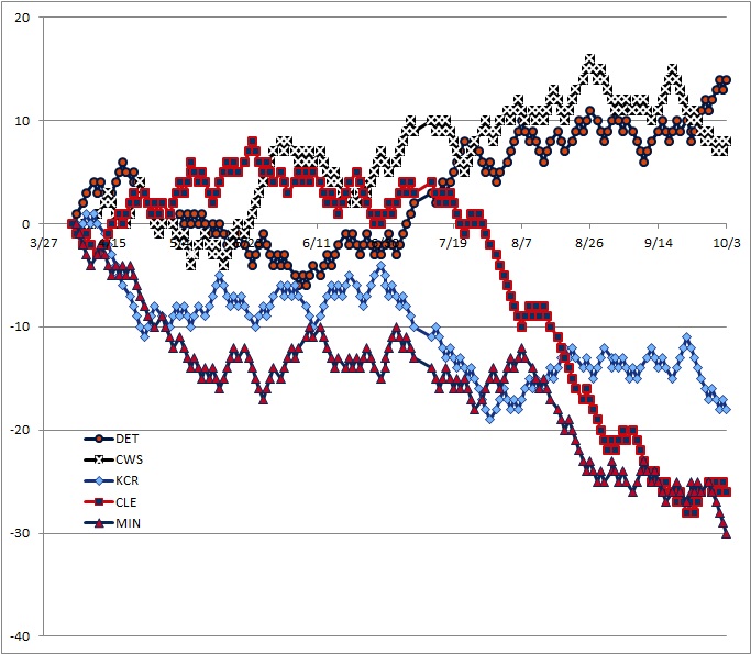
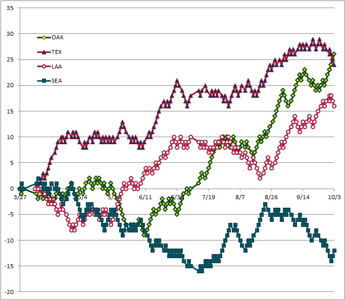
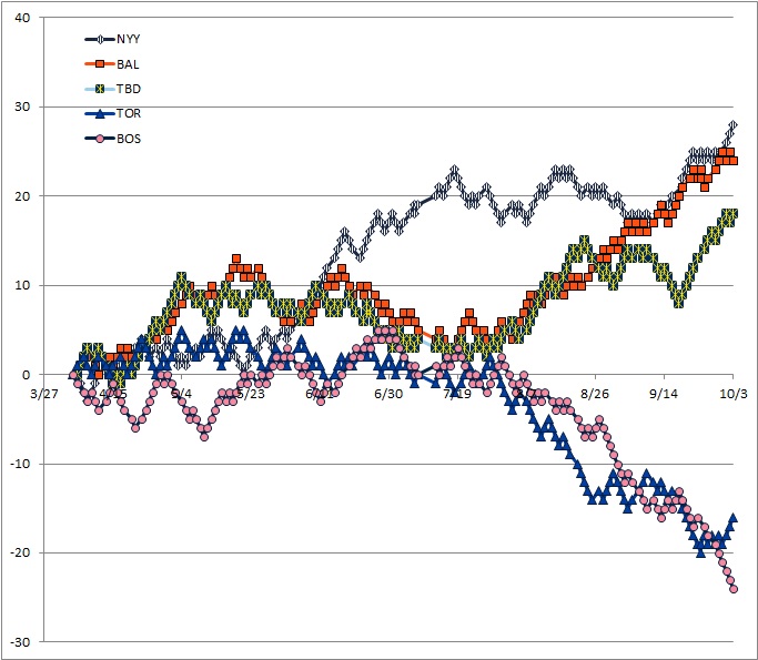
These graphs show games above or below .500 at the conclusion of each game. So double-headers will show two markers, one above the other. I started each team off at 0 on the day preceding its first game.
American League Central

American League West

Colors (mostly) match official team colors as they are in Wikipedia.
I made the BoSox color pink to represent the pink hats, and because every last team in both leagues has red and blues and I wanted something else.
I brightened the green for the Athletics so it was a higher contrast.


Ooof, that Cleveland graph would be depressing if I were a Cleveland fan.
I think Cleveland and Baltimore accidentally got on each other's team plane around the All-Star break.
The late "rally" just cost them draft position.
Hey! No foreshadowing part 3!
Mid-May, they were the only team in the division with a winning record.
Royals were one game behind the Tigers on about July 1.
That's when they were the "Windians". Didn't last long, though.
I guess then in my book they were the "Clevewinds".
That Oakland graph is pretty good. Shades of 2006 Twins.
Maybe if I'm a sucker for punishment, and you ask nicely, I could run the two on the same graph.
Or, you can find the 2006 graphs here and display them side-by-side and do the stereoscopic thing with your eyes.
The stereoscopic thing suggests that I have a good memory.
Well, I cruddily overlaid them. In 2006, Detroit peaked at about 40 games over 500 and then crashed back to 30.
Rangers played reasonably steady the whole year, with a slight end-of-season hiccup, but never really getting that far above or below a 30-games-above-500 pace.
Twins started their turnaround unambiguously and were already at 10 games over 500 before the ASG, the As had only made it back to 500 at the ASG. From their turnaround on, the Twins never went on an extended sub-500 run, while the A's did twice.
Sox graph is the definition of "choking". They even went so far to re-tease their fans with a late 5-0 run, only to go 4-11 for the rest of the season.
Royals graph should give the team hope that if April and July hadn't been on their calendars, they would have been in the mix for the division.
AMR - Thanks for this. I know there are probably a lot of graphics out there that can visually describe how a season went, but having the teams all in one place and so easy to view is a real pleasure. Well done.
I think it's interesting* to see a general divergence of the "good" and "bad" teams in the Central and East around that July 19 date marker (though the Twins & KC actually started their descent quite a bit earlier). Good teams keep going up, bad teams kept heading down.
*heartbreaking
Twins == Enron.